
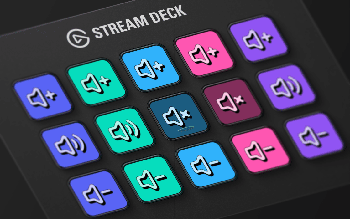

Steelseries Compagnon
Rethinking the audio experience for Steelseries GG users.
Rethinking the audio experience for Steelseries GG users.
Building your own tool is the best consistency test.
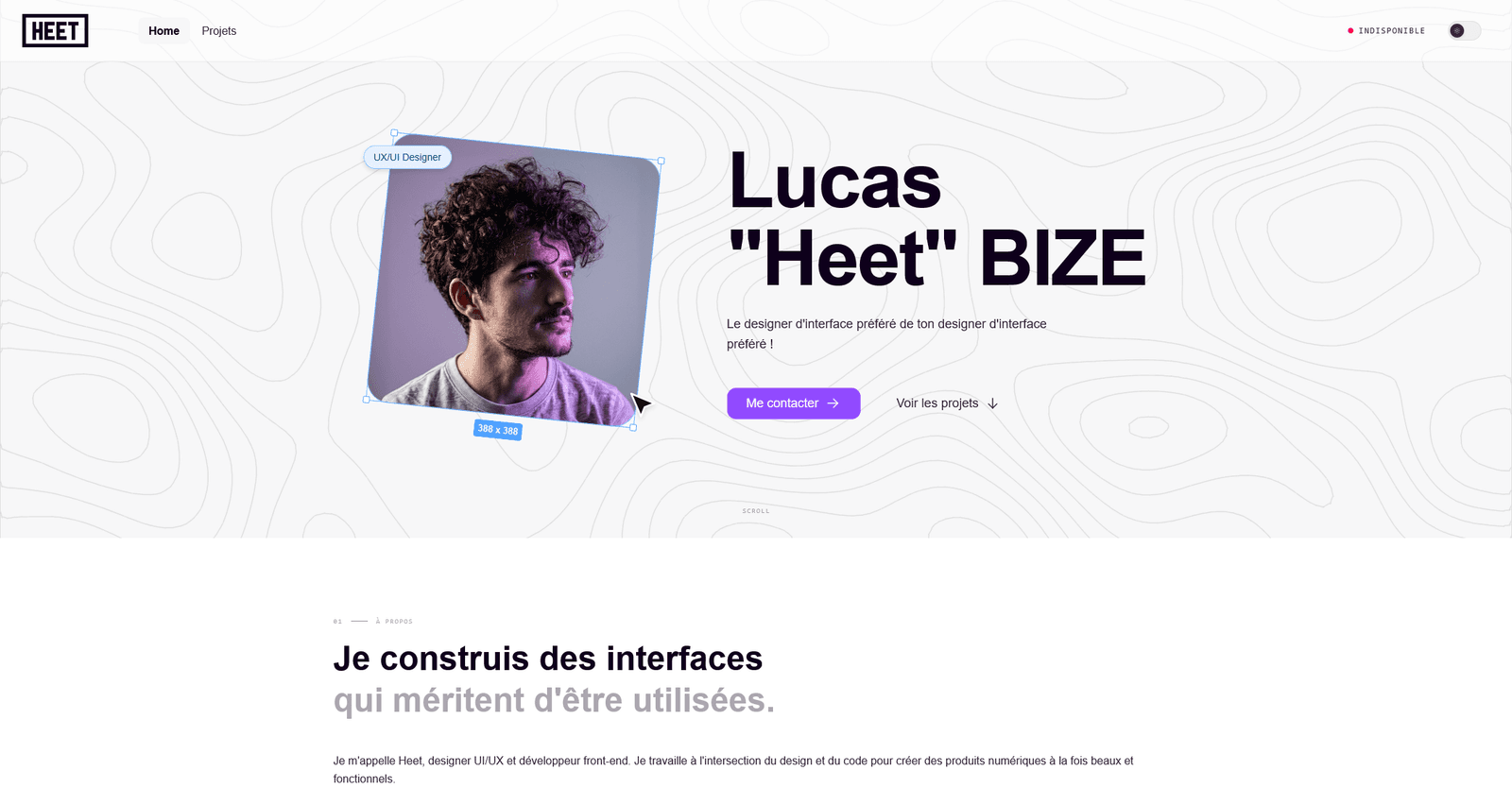
This portfolio is both a showcase and a place to experiment. Every component is built to be reused, and every animation has a reason to be there. The design system runs on a Figma → CSS tokens pipeline, with dark mode handled natively through semantic variables.
Every component starts from tokens defined in Figma (colors, typography, spacing, border radius) and exported straight to CSS variables. Dark mode is handled in one place, so components never need to know about the theme.
Motion (formerly Framer Motion) handles scroll animations, page transitions and micro-interactions. The WordScroll uses a native CSS animation measured to the pixel so the loop never jumps.
React 19 with Vite, Tailwind v4 in JIT mode, strict path aliases. Data (projects, experience, tools) lives separately in src/data, so the content can change without touching the components.